The Rule of Thirds Is a Starting Point, Not a Recipe
The rule of thirds can organise a photograph, but learning when to centre, edge or leave space gives everyday scenes a more deliberate frame.
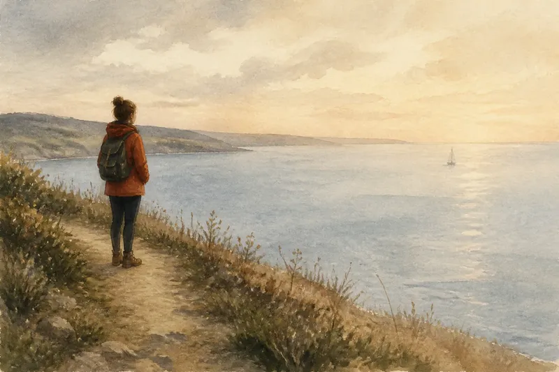
Why does placing a subject on a rule-of-thirds intersection sometimes make a photograph feel oddly arranged? The rule of thirds is useful because it gives the eye a simple starting place, but a grid cannot tell you what a particular scene needs. A frame may become clearer when its subject sits in the centre, leans towards an edge or leaves a large area of quiet space.
The important decision is not whether to follow the grid. It is where the photograph’s visual weight should sit, and what the surrounding space should do. Treat the grid as a suggestion to test against the scene rather than a recipe to obey.
What the rule of thirds does well
Imagine dividing a photograph into three equal bands across and three down. The four points where the lines cross offer possible positions for a subject, while the lines themselves can help organise a horizon, doorway or other strong boundary. Many cameras can display this grid on the screen or in the viewfinder.
These marks are useful because a subject placed away from the exact centre can create room for its surroundings. A person looking towards one side of the frame, for instance, may seem more naturally connected to the space in front of them. A horizon resting near a grid line can also give either sky or ground more visual attention.
But the grid is a compositional aid, not a rule about where every important object belongs. A face, bright window, red coat and dark doorway do not carry equal visual weight simply because they occupy similar areas. The scene’s lines, colour, contrast and direction of attention matter too.
Choose a position by asking what the subject needs
Start by noticing how the subject relates to its surroundings. Is it moving, looking, reaching or pointing in a particular direction? Does it feel connected to a nearby object, or should it stand apart? These relationships often suggest a useful position before the grid does.
Then look at what enters the frame around it. A sign, lamp post or bright patch of pavement may compete with the subject even if it sits far from a grid intersection. Shifting your viewpoint or changing the framing can reduce that distraction; placing the subject neatly on the grid will not solve it on its own.
Think of the grid like the ruled lines in a notebook: helpful for keeping things orderly, but not a reason to force every thought into the same shape. The subject’s direction and the scene’s structure should decide whether that order helps.
When does centring make a stronger picture?
Does a centred subject always look stiff?
No. Centre placement can give a photograph directness, calm or formality, especially when the subject faces the camera or has a clear, symmetrical outline. It feels awkward only when the surrounding shapes pull strongly to one side or the subject’s relationship with the scene suggests a different balance.
When should I centre a person or object?
Try centring when the subject is the unmistakable point of attention, or when the scene’s lines lead towards its middle. A person standing beneath a centred arch may feel joined to the architecture, while the same person placed off-centre could make the arch appear lopsided or incidental.
How can I tell whether the centre is working?
Look at the spaces on either side of the subject, not only at the subject itself. If they feel intentionally balanced, or if symmetry draws the eye in, the centre may be doing useful work; if a distracting shape pulls attention away, adjust the framing and look again.
Use the edge to show a relationship
Placing a subject near an edge can make the surrounding space feel active rather than empty. A cyclist close to the left edge may appear to be leaving the frame; a person near the right edge with more room ahead can seem to be looking out into the scene. The edge changes how viewers read direction.
That effect depends on what the subject is doing. Leave space in front of a gaze or movement when that open area helps the action read clearly. If the subject faces out of the frame, a tighter edge position can instead create a sense of departure or unease. Neither choice is automatically more natural; each gives the scene a different emphasis.
Watch the boundaries carefully. A subject placed near the edge can be crowded by a cropped hand, a doorway or a bright object that seems to press in. Check all four sides of the frame before settling on the composition, and decide whether the nearby elements support the relationship you want to show.
Let open space carry meaning
Open space is not necessarily wasted space. A broad, uncluttered area can make a small subject feel solitary, give a gaze room to travel or make a simple shape easier to notice. The space becomes part of the picture when its tone, texture or direction affects how the subject feels.
For example, a pale wall behind a dark plant may act as visual breathing room, while a blank section of sky can make a rooftop figure seem distant. If the empty area is visually noisy, though, it may compete rather than support. Look for branches, wires, bright reflections and uneven patches that interrupt the quiet.
Consider the edges of the open area as carefully as its size. A roofline or strip of pavement can direct attention towards the subject; a diagonal shadow may pull it away. Moving slightly to one side can change those relationships without changing the subject itself.
How can I decide where the subject belongs?
Should I turn on the camera grid?
A grid can help you judge horizons, repeated lines and possible placements, particularly when a scene feels difficult to organise. Use it as a reference, then switch your attention back to the subject and the spaces around it rather than treating an intersection as a target.
What if the background looks unbalanced?
Check which feature is pulling your eye and whether it can be excluded by changing your viewpoint or frame. If it needs to remain, consider whether moving the subject towards it creates a useful relationship or simply makes the competing shapes harder to read.
How much space should I leave around a subject?
Leave enough to show the relationship that matters: room in front of a gaze, space around a distinctive outline or distance that makes the subject seem small. The right amount depends on the scene, so compare a closer composition with a looser one and notice what each version makes you attend to.
Make a small comparison before you settle
A useful way to practise is to compose the same scene in several ways without changing what caught your attention. Try placing the subject near a grid intersection, then centred, then close to an edge with more space on one side. Compare what each frame says, rather than asking which one obeys the rule best.
Say you notice a red umbrella beneath a plain shop awning. You first place it on a grid intersection, but the awning’s strong horizontal line divides the frame awkwardly. You then centre the umbrella beneath the awning and find that the repeated vertical posts frame it; a final edge placement gives the umbrella room to point towards the pavement. The expected result is three distinct readings of one scene—order, symmetry and movement—not three versions of a correct answer.
When comparing frames, ask where your eye goes first and where it goes next. Notice whether the subject has room to look or move, whether an edge cuts through a meaningful shape and whether any background detail competes. These questions are more useful than counting how many objects sit on the grid.
Keep the composition tied to the scene
The rule of thirds is most helpful when it offers a position worth considering. It can prompt you to move a subject away from the centre, organise a horizon or leave room for a gaze. It becomes limiting only when the grid replaces attention to the actual relationships in the frame.
For the next scene you photograph, first decide what should feel important: the subject’s presence, its direction, its connection to another shape or the space around it. Then try the grid position and at least one alternative. The rule of thirds works best as a starting point because you can keep, alter or abandon its suggestion once the picture tells you what it needs.